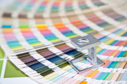
In a recent study conducted by KissMetrics.com, visual appearance and color ranked more important to consumers than just about everything else when viewing marketing materials. In fact, ninety-three percent of people who responded to the survey said that visual appearance (which color is a part of) was the most important factor they used when making a purchasing decision. Only six percent said texture, while on percent placed a heavy value on sound and smell.
Color and Marketing: Breaking it Down
Along these same lines, an incredible eighty-five percent of consumers said that color was THE primary reason why they chose to buy a particular product or service. It goes without saying that the right color design is the perfect place to start with your marketing materials.
In terms of your long-term success, one of the most valuable resources that you have available to you is and will always be your brand. It's something that lives on long after a purchase is made. It's the narrative and the set of strong, relatable values that are at the heart of your business. Additional studies have shown that the careful use of color can increase brand recognition by up to eighty percent, which, in turn, goes a long way towards increasing consumer confidence at the same time.
But What Do Colors Mean?
However, none of this is to say that your marketing materials should be jam-packed with as many colors as possible. Quite the contrary, in fact. Different colors have all been known to affect people on an emotional and psychological level in a variety of ways. Consider the following:
Yellow is often associated with optimism and youthful enthusiasm. This is why it's often used to grab the attention of people like window shoppers.
Red is almost always associated with a sense of energy and excitement. In fact, red is a great way to create a sense of urgency in your readers (and when used right can even increase their heart rate, too!)
Black is considered to be very powerful and very sleek, which is why it is usually used to market luxury products.
Green is normally associated with wealth - which makes perfect sense because money is green. It also happens to be the easiest color for the human eyes to process, which is why green is often used to underline important information in marketing copy.
To that end, it's important to use different colors depending on exactly what it is you're trying to accomplish. Are you trying to highlight an upcoming clearance sale and want to create a sense of urgency? Make sure those fliers and posters have as much red on them as possible. Are you trying to attract the attention of a more sophisticated level of clientele, or do you want to positively influence the overall impression that people get when they see your products? Try using as much black as you can.
Color is a powerful tool when used correctly, but it's important to remember that it is just one of many. But, provided your use of color matches up with both your audience and your long-term objectives, you'll find that it can be a terrific way to put your campaigns over the top and start generating the types of results you deserve.


.png)
.jpg)

